Grid Manager (PCB)
Contents
- Accessing the Grid Manager
- Creating and Defining a Cartesian Grid
- Settings
- Steps
- Origin
- Display
- Extents
- Quadrants
- Creating and Defining a Polar Grid
- Settings
- Steps
- Origin
- Display
- Angular Range
- Radial Range
- Creating and Defining a Component Grid
- Default Snap Grid
- Defining Grid Display
- Nesting and Grid Priority
- Disabling a Grid
- Exporting and Importing Grids
- Defining a Custom Grid for a PCB Library Component
- Deleting a Grid
Parent article: Unified Cursor-Snap System
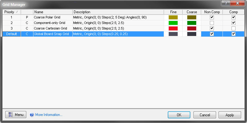
The Grid Manager dialog.
The Grid Manager dialog provides a centralized location from which to define and manage all grids for the active PCB document. The dialog provides all controls necessary to facilitate creation of your own customized, local placement grids. Supporting Cartesian and Polar grid 'flavors', you can define any number of grids for use in a document, which can even be nested as required. Tailor grids to suit both your personal placement preferences and design requirements – with the Grid Manager you'll never be short of a grid to get even the trickiest of placements achieved!
Accessing the Grid Manager
The Grid Manager dialog can be accessed from a PCB document (or PCB Library document) in the following ways:
- Using the Grids command on the menu associated to the Snap button, at the bottom-right of the main design window.

- Using the G,M shortcuts.
- From the main Tools menu (Tools»Grid Manager).
- Clicking the Grids button in the Board Options dialog (Design»Board Options).
- From the main View menu (View»Grids»Grid Manager).
- From the right-click menu for the workspace (on the Snap Grid sub-menu).
Creating and Defining a Cartesian Grid
To create a new Cartesian-type grid use the Add Cartesian Grid command – available from the dialog's main menu or right-click menu – or press the R key. A new grid entry will appear in the list, initially with the default name New Cartesian Grid. A Cartesian grid is distinguished by the letter C, to the left of the grid name field.
Example addition of a new Cartesian grid.
To edit the grid, simply double-click on its entry, or select its entry and use the Properties command accessible through the dialog's menus. The Cartesian Grid Editor dialog will appear presenting options with which to define the grid.
Example Cartesian grid definition, using the Cartesian Grid Editor dialog, and resulting appearance in the workspace.
The following sections take a closer look at the options available in each of the distinct regions of the dialog.
Settings
Use the Name field to give the grid a more meaningful name. For example, you might name the grid using a format that reflects its purpose (e.g. Grid for Component-Side Memory).
Use the Unit field to specify the measurement units used for the grid – Imperial or Metric.
Use the Rotation field to specify whether the grid is to be rotated (about the specified origin point), and by how much.
Steps
Use the options in this region to specify the sizing of the grid.
The Step X and Step Y fields define the distance between grid lines in the x and y planes respectively. By default, the two fields are linked, as indicated by the continuous chain depicted on the button to the right of the fields. In this state, whatever you specify for the Step X field will be copied and used for the Step Y field. To break this link and enter step sizes individually, simply click this button. The button will now depict a broken chain, and the Step Y field will become available for editing in its own right.
Click the 'chain button' to toggle between Step Y following Step X (linked) or Step Y defined separately (not linked).
Type the required step size directly in each case, or select from a range of common sizes available in the associated drop-down list. Controls are also available that allow you to define the x and/or y step sizes directly from within the PCB workspace. In each case, you will be taken to the workspace to specify two 'calculating' locations, and the resulting step size will be calculated accordingly.
- Set Step X in PCB View – the resulting size is taken as the hypotenuse of the triangle formed by the chosen points in the workspace.
- Set Step Y in PCB View – the resulting size is taken as the hypotenuse of the triangle formed by the chosen points in the workspace.
- Set Step X from Delta X – the resulting size is taken using just the difference in the X coordinate.
- Set Step Y from Delta Y – the resulting size is taken using just the difference in the Y coordinate.
- Set Both Steps from Delta – the resulting sizes are taken using just the differences in the X and Y coordinates respectively.
Origin
Use this region to define the origin for the grid. Use the Origin X and Origin Y fields to specify the x and y coordinates for the center point of the grid in the workspace. Either enter the values for these coordinates directly, or click the Set Origin in PCB View link and physically click at the desired location in the workspace (the resultant coordinate values will be entered into the fields).
Display
Use the options in this region to define the visual appearance of the grid in the workspace. Two levels can be defined – Fine and Coarse. The former is a display of the grid markers using the defined step sizes. The latter is simply a display of grid markers spaced at a multiple of the defined step sizes. See Defining Grid Display for more information.
Extents
Use the options in this region to specify the extents of the grid, in terms of Width and Height. By default, the two fields are linked, as indicated by the continuous chain depicted on the button to the right of the fields. In this state, whatever you specify for the Width field will be copied and used for the Height field – giving a square grid. To break this link and enter width and height individually, simply click this button. The button will now depict a broken chain, and the Height field will become available for editing in its own right.
Click the 'chain button' to toggle between Height following Width (linked) or Height defined separately (not linked).
Type the required width and/or height directly in each case. Controls are also available that allow you to define the width and/or height directly from within the PCB workspace. In each case, you will be taken to the workspace to specify two 'calculating' locations, and the resulting width and/or height will be calculated accordingly.
- Set Width in PCB View – the resulting width is taken using just the difference in the X coordinate.
- Set Height in PCB View – the resulting height is taken using just the difference in the Y coordinate
- Set Width and Height in PCB View – the resulting width and height are taken using just the differences in the X and Y coordinates respectively.
Quadrants
Use this region to specify which quadrants the grid is to occupy. The grid area is the same for all enabled quadrants, as defined by the setting for Width and Height in the Extents region of the dialog.
Creating and Defining a Polar Grid
To create a new Polar-type grid use the Add Polar Grid command – available from the Grid Manager dialog's main menu or right-click menu – or press the P key. A new grid entry will appear in the list, initially with the default name New Polar Grid. A Polar grid is distinguished by the letter P, to the left of the grid name field.
Example addition of a new Polar grid.
To edit the grid, simply double-click on its entry, or select its entry and use the Properties command accessible through the dialog's menus. The Polar Grid Editor dialog will appear presenting options with which to define the grid.
Example Polar grid definition, using the Polar Grid Editor dialog, and resulting appearance in the workspace.
The following sections take a closer look at the options available in each of the distinct regions of the dialog.
Settings
Use the Name field to give the grid a more meaningful name. For example, you might name the grid using a format that reflects its purpose (e.g. Grid for Circular LED Placement).
Use the Unit field to specify the measurement units used for the grid – Imperial or Metric.
Steps
Use the options in this region to specify the sizing of the grid.
The Angular Step field defines the distance, in Degrees, between the angular grid lines. This value is used to equally space the angular grid lines over the defined angular range.
The Radial Step field defines the distance between the radial grid lines. Type the required step size directly, or select from a range of common sizes available in the associated drop-down list. You can also define the radial step directly from within the PCB workspace, by clicking the Set Radial Step in PCB View control. You will be taken to the workspace to specify two 'calculating' locations – the resulting step size is taken as the hypotenuse of the triangle formed by the chosen points in the workspace.
Origin
Use this region to define the origin for the grid. Use the Origin X and Origin Y fields to specify the x and y coordinates for the center point of the grid in the workspace. Either enter the values for these coordinates directly, or click the Set Origin in PCB View link and physically click at the desired location in the workspace (the resultant coordinate values will be entered into the fields).
Display
Use the options in this region to define the visual appearance of the grid in the workspace. Two levels can be defined – Fine and Coarse. The former is a display of the grid markers using the defined step sizes. The latter is simply a display of grid markers spaced at a multiple of the defined step sizes. See Defining Grid Display for more information.
Angular Range
Use the options in this region to define the angular extents of the grid:
- Start Angle – determines the angle of the grid's first angular grid line.
- End Angle – determines the angle of the grid's last angular grid line.
Radial Range
Use the options in this region to specify the radial extents of the grid:
- Min – determines the distance from the origin point to the grid's first radial grid line.
- Max – determines the distance from the origin point to the grid's last radial grid line.
Creating and Defining a Component Grid
If required, you can create a Cartesian or polar grid that is for component placement only. The grid is created and configured in exactly the same way as any other Cartesian or polar grid (as described above), the only difference is that you enable check boxes to configure it as component-only. This is done in the Grid Manager dialog, as shown in the image below.
Configure the options to set a grid as component-only.
The Comp and Non Comp options behave together as follows:
|
| COMP = False | COMP = True |
|---|---|---|
| NON COMP = False | Grid is never visible or applied | Grid is only visible and applied during component actions |
| NON COMP = True | Grid visible and applied for non-component actions | Grid is visible and applied for both ordinary actions and component actions |
To set a grid as a component-only grid, enable the Comp option and disable the Non Comp option. Note that this component-only grid will only display when you are performing a component-type action, such as moving a component.
Default Snap Grid
A default snap grid is defined for the board, named Global Board Snap Grid. This is the grid that is used for object placement and movement in any area of the board not covered by a dedicated local grid.
Global Board Snap Grid - used by default wherever no customized local grid is present.
You are able to change the following with respect to the default grid:
- Step size.
- Display.
As the default grid is a Cartesian-type grid, refer to Creating and Defining a Cartesian Grid for information on editing these properties.
Defining Grid Display
For any custom grid you define, as well as the Global Board Snap Grid, options are provided to control how the grid is presented visually in the workspace. Two levels can be defined – Fine and Coarse. The fine-level display grid is for when you are more zoomed-in. The grid markers for this level of grid display follow directly the defined step sizes for the grid. The optional coarse-level display grid comes into play as you zoom out. The grid markers for this level of grid display are based on a specified multiple of the defined step sizes.
Options for controlling the display of a grid in the PCB workspace.
- Fine – use the associated drop-down to define the markers used for the fine-level display of the grid in the workspace, either
LinesorDots. The step size used for the markers is that you have defined in the Steps region. Click on the associated color swatch to access the standard Choose Color dialog, from where you can specify the color to be used for the fine-level display grid in the workspace. You can always reset the color back to its default using the Reset to Default link.
- Coarse – use the associated drop-down to define the markers used for the coarse-level display of the grid in the workspace. Again, choose from either
LinesorDots. The coarse-level display grid is simply the fine-level display grid with an increased step size. Use the Multiplier field to specify the required multiple of the grid's step size, either2x,5x, or10x. If you don't want to use the coarse-level display grid, simply choose the optionDo Not Draw.
Click on the associated color swatch to access the standard Choose Color dialog, from where you can specify the color to be used for the coarse-level display grid in the workspace. You are free to choose a completely different color to that used for the fine-level display grid. Alternatively, you can quickly employ a lighter or darker shade of the color currently used for the fine-level display grid, using the available Lighter or Darker links respectively. Again, you can reset the color back to its default using the Reset to Default link.
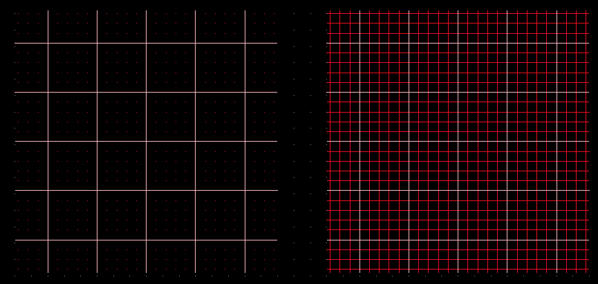
Example Cartesian grid with fine\- and coarse-level display grids presented in the workspace. Left: Fine-level displayed using dots, coarse-level using Lines.
Right: Both fine\- and coarse-level grids displayed using Lines.
Although individual grid display coloring is defined when editing a grid in the specific grid editor, you can quickly assign a single nominated color for the fine- or coarse-level display grids – on a global level to all defined grids, including the default grid – from within the Grid Manager dialog. To do this, simply use the Set Fine Color for All or Set Coarse Color for All commands from the dialog's menus, then choose the required color from the subsequent Choose Color dialog.
Nesting and Grid Priority
Grids you define in the Grid Manager dialog can be freely stacked within the board area. By specifying origin coordinates accordingly, you can overlap grids, creating a nested hierarchy of grids, with which to fine tune placement of design objects as you layout your board.
Grid contention – which grid in an overlapping stackup of grids should a design object snap to – is resolved using a priority system. Each local placement grid you create and define is given a numbered priority. By default, each new grid is given the highest priority of 1, with all existing grids moved down in priority accordingly.
The Global Board Snap Grid is an exception. As it is the default grid that is used in all areas of the board that are not 'covered' by defined custom grids, it is given the priority setting of Default. It has the lowest 'snapping priority' of all defined grids.
In the workspace, priority is distinguished by drawing order. The highest priority grid (priority 1) will be drawn in front of all other grids, then the grid with priority level 2, and so on, down to the default Global Board Snap Grid, which is drawn behind all other custom grids.
An example of three nested Polar grids. The Yellow Polar Grid has the highest priority and appears on top. The Red Polar Grid is next
priority, appearing behind the yellow grid, but in front of the aqua grid. The default grid appears behind all of these grids, as all custom grids take
precedence over it in the priority stakes.
Change the priority for a grid by selecting it in the list and using the Increment Priority and Decrement Priority commands (available from the dialog's menus) as required. A number of keyboard shortcuts are also available for setting the priority:
- U or Ctrl+Up Arrow – increase the priority of the focused grid.
- D or Ctrl+Down Arrow – decrease the priority of the focused grid.
- Number keys 1-9 – focus the grid with the same numeric priority. Shift focus to the default snap grid (
Global Board Snap Grid) using the 0 (zero) key.
- H or B – make the currently focused grid the highest priority (i.e.
1).
Disabling a Grid
You've defined a grid and placed it at the desired location within the board area. Perhaps it is even part of a set of overlapping (nested) grids. You may have occasion where you don't want to use the grid while placing or moving a particular design object. Rather than deleting the grid – you may well use it again later, in the same or different area of the board – you can simply 'hide' it from the workspace. This can be achieved by unchecking the grid's associated Enabled attribute in the Grid Manager dialog.
Disable a local grid to effectively hide it, therefore preventing objects snapping to it. Using the nested grids example, the red Polar grid has been disabled.
As the grid is not deleted, you can re-enable and use again when needed without having to redefine it\!
Exporting and Importing Grids
Custom grids can be exported from a board and imported into another board, if required. Importing and exporting grids is performed in the Grid Manager dialog.
- To export all grids, click the Menu button and choose Export All from the menu. The Save PCBGrid dialog will open, browse to a suitable location, define the File name and click Save to create the *.PCBGrid file.
- To export specific grids first select the required grids (using the Ctrl+Click shortcuts), click the Menu button and choose Export Selected from the menu. The Save PCBGrid dialog will open, browse to a suitable location, define the File name and click Save to create the *.PCBGrid file.
- To import grids, click the Menu button and choose Import Grids from the menu. The Load Custom Grid dialog will open, browse and select the appropriate .PCBGrid file, then click *Open to import the grids defined in that file.
Defining a Custom Grid for a PCB Library Component
As well as defining custom grids in the PCB workspace, you can also define a custom grid in the PCB Library Editor. When you define a custom grid in the Library Editor it only applies to the current component, to use it for other components Export it from the current component and Import it to any other components requiring the same grid.
Deleting a Grid
Custom grids can be deleted simply by selecting their corresponding entry in the Grid Manager dialog and using the Delete command from the dialog's menus. Remember that the default Global Board Snap Grid cannot be deleted.